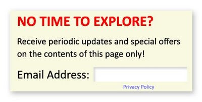

This little tiny form serves 2 purposes:
- It generates a new lead (with an email address) in exchange for providing a service (saving the visitor time by pushing relevant content to them)
- It provides valuable segmentation so you can continue to send relevant content to this person.
Yes, I know you have a Contact Us form, but:
- Visitors have to find it
- Visitors have to fill out more than one field typically
- Usually visitors don’t get to pick what content they want to receive
Besides, this doesn’t replace your Contact Us form, it is just a convenient adjunct.
Little Tiny Form Do’s and Don’ts
Do make it obvious. Adding a tiny text link at the bottom of the page will get you zero submissions. Make it obvious, bold and inviting – usually the upper left or right corner is best.
Do add it to product or service-specific pages. If product X actually covers multiple pages, add it to each of those pages. A submission to any of these pages, means your visitor is interested in Product X.
Don’t add it to pages that you don’t have additional content to send them. If someone submits this, they will expect to receive something. It doesn’t mean you need to send them something new every day. See my blog post on communication frequency Best Practices.
Don’t expect a huge response. But try modifying the placement, size or discontinuity of this tiny little form if your submissions are weak. You might be surprised to be getting more submissions from these little forms than from your regular Contact Us page.
Also, just adding the opportunity to sign up for something on a given page won’t work unless you provide a clear benefit in doing so. In this case, offering to save the visitor time, do less work and only get the exact content they are interested in seems like a fair exchange for providing their email address.
You've probably spent hours and hours developing and updating your website. Here is a fanatastic (and free) way of generating new, segmented leads.
Steve Kellogg
aDemand Generation/Marketing Automation Consultant, Astadia
aEloqua Certified Marketing Best Practices Consultant
On Twitter? Tweet this Post


Hi Steve! Targeting clients with very little time to read website content is a difficult task for most site owners. I liked the suggestion that you gave about the 'little form'. Visitors can get updates from the site without having to waste time reading the other site components.
ReplyDeleteWe actually launched a site last year with the help of a (Toronto) web developer. We included in the site relevant information about our company and products. A web designer (Toronto) updates the site by adding icons and additional information. I like your recommendation, so I'd ask him to include a little form box on our site, too.
Very helpful suggestion. Thanks!
good blog writing. you are good writer Alarm repair Naples FL
ReplyDelete