I thought it would be fun to visit the home pages of Ford, Toyota, GM, Nissan, etc and see how each was taking advantage of the huge uplift in web traffic that all this buzz is generating. What a golden opportunity to capture net new leads into their databases for distribution to their dealers! So how is everyone doing?
Ford's Home Page:
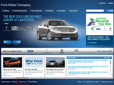 Wow, it took me 5 minutes just to find the "Contact Ford" link. It's at the very bottom left (see the red box above). Once you clicked on it you get this:
 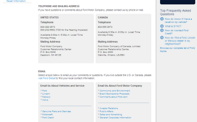 No lead capture signup form, not even a "Enter Your Email Address" box. Just a list of phone numbers and a few email links! A golden opportunity to collect new leads, completely wasted.
GM's Website:
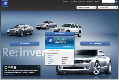 Wow, no "Sign Up Now" link whatsoever. Not even a "Contact Us" link.
Nissan's Home Page:
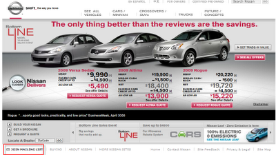 Ah, the first website that actually mentions the "Cash for Clunker" program. In fact they show the savings right up front! Still I had to dig to find the "Join Mailing List" link (see the red box at the bottom left).
Once you click the link you get this:
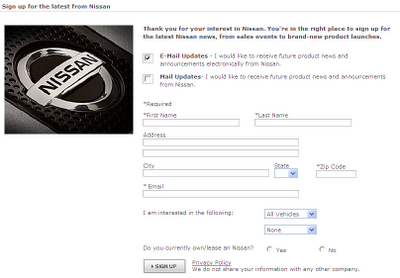 Ah, at last a lead capture form! Nice and short, not too many fields. A nice touch, asking whether I preferred direct mail and/or email. No segmentation however, other than choosing the model of car you are interested in, which is certainly better than nothing.
Toyota's Home Page
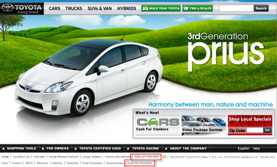
The "Sign Up for Info" link is still hard to find (see red box bottom middle). They also have a small "Cash for Cars" link. When you click the "Sign Up for Info" link, you get this:
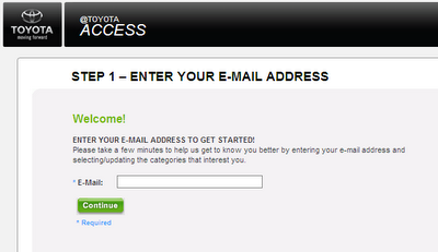
Now we're talkin! A clean simple email address field! Be still my heart, could this possibly be a Progressive sign-up form?
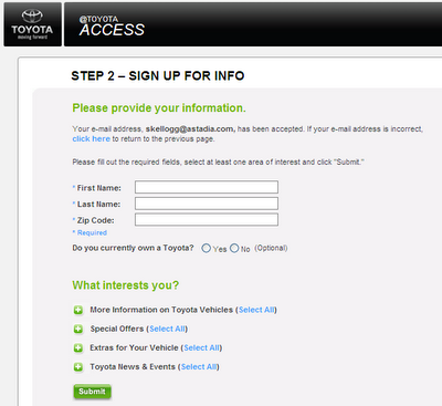
It is! The farm is saved. An actual subscription preference center. And they actually ask me, "What Interests You?" (Quick, somebody hand me a tissue).
They even took usability a step further. They keep the page nice and clean. Then if you choose "More information on Toyota Vehicles" for example, thanks to some lovely javascript, you see this:
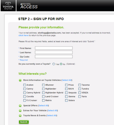
The page expands to see all the model choices! Here's what the full page looks like if you expanded all the questions:
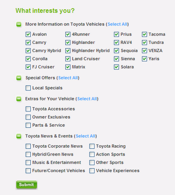
A great example of segmentation - and not overwelming you with choices until you ask to see them! Sniff, sniff, and you wonder why Toyota is #1...
Audi's Home Page:
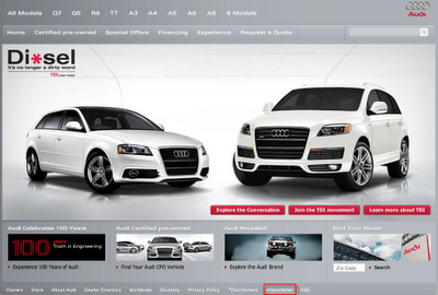
Once again, a tiny "Contact Us" link. Once you click on it you get this:
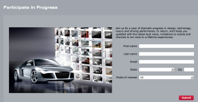
Nice clean web to lead form. Not as advanced as Toyota's however. After clicking submit you get this:
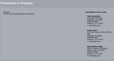
Audi was kind enough to show me the 3 closest dealers in my area. And I didn't even have to ask, sniff, sniff.
Mercedes Benz Home Page:
The first time I've seen this, a "Receive Updates" link - big, bold and beautiful, in the upper right hand corner!
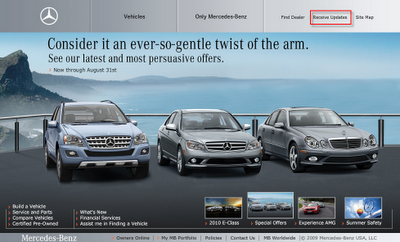 One wierd thing -- when you click the link, a blank box appears with a SUBMIT button next to it (see screenshot below).
 Do they think I am the Amazing Kreskin? What am I supposed to fill in here? So I typed in, "What am I supposed to fill in here?" and clicked Submit. I got a nice little error that said, "Submit a valid email address".
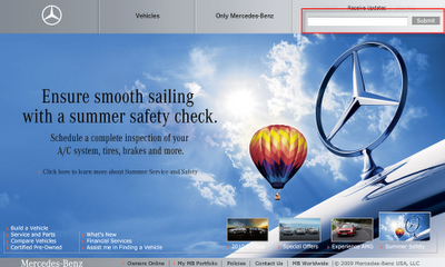 When you click on it, you get this:
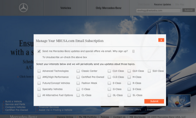
Ah, another subscription preference center. Not as thoughtful as Toyota's but still, not bad. Extra kudos for having the home page link actually noticable (even though they assume you'll know what to insert).
Porsche's Home Page:
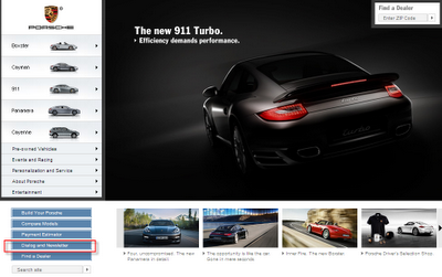
It didn't take me too long to find this link: "Dialog and Newsletter".
Just the sound of this link makes me want to yawn. Have you ever seen a more boring and emotionless CTA? I'm a sports car fanatic for God's sake! At least make it sound exciting for me to sign up! Or at least change it to "Signup or Not, Whatever".
Once you click the link, you get this:
Just the sound of this link makes me want to yawn. Have you ever seen a more boring and emotionless CTA? I'm a sports car fanatic for God's sake! At least make it sound exciting for me to sign up! Or at least change it to "Signup or Not, Whatever".
Once you click the link, you get this:
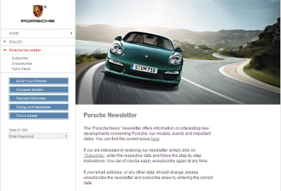
Once again, I am tasked with emulating the Amazing Kreskin in figuring out what to do next. Do you see a form anywhere? Do you see a clear CTA anywhere?
I am expected to actually read the instructions apparently. Clearly Porcshe does not care whether I sign up or not. (Maybe they somehow know that I already own one. That must be it).
Conclusion:
Yes, I know this is B2C. And clearly car makers all share a similar model of driving business to their dealers, not gathering leads for themselves.
Still, you can't buy the kind of media attention Cash for Clunkers is generating. Even if one has no insterest in buying a car, I'm sure there are many, many people browsing their favorite car maker's website just to see what all the hubbub is about. And at some point they will need a new car. A golden opportunity to collect valuable future leads. Some do it better than others as we've seen.
Be Ready
If you are lucky enough to have the media focused on an event that effects your industry, jump all over it. Have your sign-up form link prominently placed on your home page. Be prepared to leverage all this free attention better than any of your competitors.
What You Can Do Now
What You Can Do Now
Insepct your competitor's websites and see how they manage subscription sign ups. Are they Porsche or are they Toyota? It is fairly easy to tell just how advanced their marketing is simply by inspecting the level of segmentation they ask for up front. If you are better at it, keep going, get even better! If you are worse at it than your competitors, well,,,you know what to do.
Updated 5-8-12
Visit my brand new website and learn more about Website Optimization Best Practices
Updated 5-8-12
Visit my brand new website and learn more about Website Optimization Best Practices
Steve Kellogg
-Demand Generation/Marketing Automation Consultant, Astadia
-Eloqua Certified Marketing Best Practices Consultant
On Twitter? Tweet this Post


Hello .. I am truly grateful with those responsible for creating this blog, reading is something that I enjoy very much, for this reason, I have a habit to read articles like this every day. The theme was really interesting, as the content. Some time ago I attended a conference called guanacaste costa rica real estate, this conference was very creative, and also developed similar themes to those discussed on this blog.
ReplyDelete