
Forcing viewers to have to scroll horizontally just to see all your message is just not right.
Wouldn’t it be great if you could design your emails to automatically scale to whatever width the end user has available in their preview pane, no matter how wide or narrow it is – even on mobile phones?
Usually the width of most emails is dictated by the width of the header image. If the header image is 600px wide, then the email must be 600px wide as well. WARNING: Horizontal Scrolling Alert!
Usually the width of most emails is dictated by the width of the header image. If the header image is 600px wide, then the email must be 600px wide as well. WARNING: Horizontal Scrolling Alert!
The challenge is that we really don't know what any given viewer's available width really is. It could be 350px wide, it could be 550px wide, etc. depending on how their email window is set up.
So let's forget about pixels altogether and instead make the width a percentage instead.
100% = means that the email will scale to 100% of the available width
90% = the email will scale to 90% of the available width – great if you want a bit of white space on the left and right side
80% = the email will scale to 80% of the available width – great if you want even more white space on the left and right side
Etc.
90% = the email will scale to 90% of the available width – great if you want a bit of white space on the left and right side
80% = the email will scale to 80% of the available width – great if you want even more white space on the left and right side
Etc.
So does this mean that your header image will automatically scale 100%? Alas no. If your header image is 600px and the available viewing width is 700px then the email will expand wider than the header image. But if the available viewing area is only 500px, then the email has to expand to at least 600px to accommodate the header (we’re back to our original problem).
The trick to getting this to work is to make the header image small enough that there is no horizontal scrolling on any device, even mobile devices. This means your header can’t be any wider than about 320px.
The trick to getting this to work is to make the header image small enough that there is no horizontal scrolling on any device, even mobile devices. This means your header can’t be any wider than about 320px.
Filling the Gaps
Obvioulsy a 320px header might loook pretty stupid if there are big gaps to the left and right. One solution to fill the gap is what we at Astadia use. The actual header image is only 320px but we added a blue background color within the image itself that appears to span the whole width of the email.
In fact the blue to the left and right of the image is not an image at all, but just a color fill to match the blue in the background of our image.
Now it looks like a blue colored header with the logo image in the middle.
How to do it
Now it looks like a blue colored header with the logo image in the middle.
How to do it
Step 1: Create a 2-column table (set the width to 100%)
 Step 2: Insert the header image inside the left colum and right-justify it
 Step 3: Add a background color to the left column that matches the background color of your header
 Step 4: Add the same background color to the right column
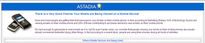 Step 5: Add some white text to the right column and make sure to left-justify it
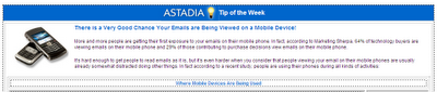 Now, no matter how wide or narrow the window is, the email always fills 100% of the space - with no horizontal scrolling! And the header always looks nice and centered!
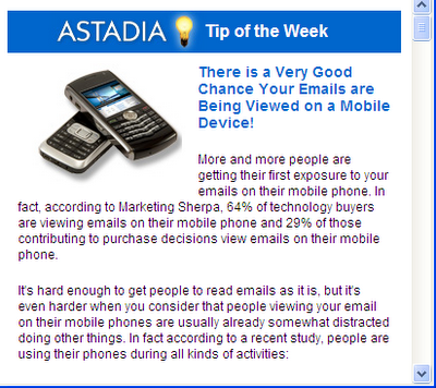
320px wide
600px wide
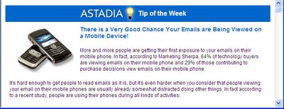
BTW: This was taken from an Astadia Tip of the Week I wrote called, Designing Emails for Mobile Devices. If you are not signed up to receive these free weekly tips, contributed by the entire Astadia-Eloqua team, sign up now!
Steve Kellogg
-Demand Generation/Marketing Automation Consultant, Astadia
-Eloqua Certified Marketing Best Practices Consultant
-Demand Generation/Marketing Automation Consultant, Astadia
-Eloqua Certified Marketing Best Practices Consultant
 Posts
Posts


Articles of this web site are usually excellent and also appreciative.
ReplyDeleteSeo Services in Ohio & Website Designing Services Ohio
Thanks for sharing post.
ReplyDeleteتعمیر کامپیوتر در محل
نمایندگی اچ پی
نمایندگی شارپ
نمایندگی شارپ
فروش لایسنس آنتی ویروس
تعمیر کامپیوتر در محل
تبلیغ رایگان
فروش آنتی ویروس kaspersky
فروش آنتی ویروس eset
فروش آنتی ویروس آویرا
Wow Very Nice Post I really like This Post. Please share more post.
ReplyDelete3D Scanning Services Near Me
3D Scanning Reverse Engineering
Excellent insights on user-centered web design! Prioritizing user experience is essential in today’s digital world. The article clearly shows how usability and empathy shape better online products. Keep sharing more design-focused content like this.
ReplyDeleteDigital Marketing Course in Hyderabad